In the Part I, I wrote about milestone along the journey to the Vizamp logo. In this post I want to talk about the technological offshoot of that journey that helped us hone in on the design.
By the time I knew what the constituents of the design were, I was growing tired of fiddling around in illustrator to come up with variations. So I built a browser based tool, using knowhow gained in creating Vizamp visualizations, to parameterise the design elements so that variations could be tested easily. This was the breakthrough that allowed me to iterate at lightening speed and work out the final design as productively and precisely as a professional designer might. To boot, I now have a tool to quickly churn out different size and and variations of the logo when I need them. For example our favicon needed to be chunkier to be easily discernible at a small size, so the tool allowed me to create it as quickly as writing this sentence. The code used in the tool is also used to display and animate the logo on the Vizamp homepage.
You can check out the code on here GitHub. You’ll notice the parameters for the logo get appended as a hash link to the URL, making it possible to send someone a specific version of the logo with a link.
I’m going to dive into the code for those of you that are interested.
Ingredients
- NPM, Babel, Browserify
- JavaScript/HTML5/CSS
- HTML5 Canvas 2D
Instructions
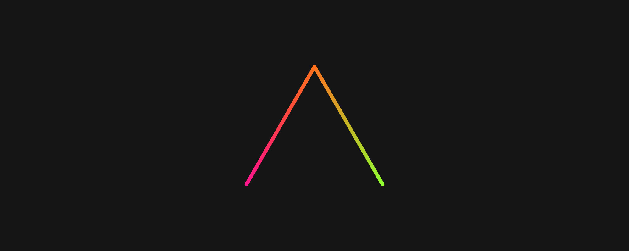
The design is based around the shape of a hexagram. A unicursal hexagram to be precise; unicursal meaning it can be drawn with a pen or brush in a single stroke. The final logo has two of the lines removed and the remaining 4 moved vertically together into alignment. This pretty much describes how the logo is drawn in code as well.
For input, I have 6 objects that represent the edges of the shape:
edges = [
    {c: 1, from: 2, to: 5, yos: 0, hex: 1},
    {c: 4, from: 1, to: 4, yos: 0, hex: 1},
    {c: 3, from: 3, to: 1, yos: 1, hex: 0},
    {c: 2, from: 5, to: 3, yos: 1, hex: 0},
    {c: 5, from: 4, to: 0, yos: -1, hex: 0},
    {c: 0, from: 0, to: 2, yos: -1, hex: 0},
]
Where: - properties from and to represent 6 points (0 to 5) along a circle, which form the hexagonal vertices - c represents the color offset - yos the Y axis directional offset - hex whether or not to display the line either for a unicursal hexagon or the final logo design
The drawing loop iterates over the input. First calculated are the points along the circle for the edge to be drawn:
x1 = centerX + Math.sin(DEG_60 * v.from) * zoom * aspect,
y1 = centerY + Math.cos(DEG_60 * v.from) * zoom + offsetY,
x2 = centerX + Math.sin(DEG_60 * v.to) * zoom * aspect,
y2 = centerY + Math.cos(DEG_60 * v.to) * zoom + offsetY,
DEG_60 (1 sixth of a circle) is in radians so multiplying it by the from or to values give you the angle in radians from the center to where the point sits. Hitting that value up with a sine or cosine function will give you a number that can be plotted on the x or y axis respectively.
The zoom multiplier will determine how far along an axis the point will be plotted. The aspect multiplier is the same as zoom but only applied to the X axis to give the effect of stretching or compressing the shape vertically.
The offsetY value is there to bring the V and A elements of the shape together and is derived from the yos input property:
offsetY = inputs.unicursal ? 0 : radius * separation * v.yostheta = Math.atan((x2 - x1) / (y2 - y1))Now I have to derive 4 point of a rectangle that will make up the edge:
tx1 = Math.sin(theta + DEG_90) * thickness,
ty1 = Math.cos(theta + DEG_90) * thickness,
tx2 = Math.sin(theta - DEG_90) * thickness,
ty2 = Math.cos(theta - DEG_90) * thickness,
So these points are 90 degrees out from the line with a distance determined by the thickness multiplier.
Each line will be shaded with a color starting with an offset determined by the sequence in which the line is plotted - this is a unicursal shape after all. Conveniently, color hue in JavaScript or CSS is plotted along a range from 0 to 360 so each of the 6 lines is separated by a value of 60, the same as the angle between each line. Don’t you love when numbers line up like this?
colorStop0 = hue + v.c * COLOR_RANGE,
colorStop1 = hue + v.c * COLOR_RANGE + COLOR_RANGE,
The hue range for the gradient, starts with the current hue base value plus the offset c value with a range of 60. The hue base value is continuously rotated between 0 and 360 which gives the effect of color flowing along the unicursal hexagram. You can see effect animated in the tool.
With each of these values calculated, drawing the logo is simply a matter of plotting the shapes on a canvas and filling it with the color gradient:
gradient.addColorStop(0, `hsla(${colorStop0}, 100%, 50%, 1)`);
gradient.addColorStop(1, `hsla(${colorStop1}, 100%, 50%, 1)`);
ctx.fillStyle = gradient;

ctx.beginPath();
ctx.moveTo(x1 + tx1, y1 + ty1);
ctx.lineTo(x2 - tx2, y2 - ty2);
ctx.lineTo(x2 + tx2, y2 + ty2);
ctx.lineTo(x1 - tx1, y1 - ty1);
ctx.lineTo(x1 + tx1, y1 + ty1);
ctx.fill();

ctx.beginPath();
ctx.arc(x2, y2, thickness, 0, DEG_360);
ctx.arc(x1, y1, thickness, 0, DEG_360);
ctx.fill();
The last shape drawn is a small filled circle at the end of the line to give it a nice round finish.
Next week I’ll write about the effects used in Vizamp visualisations called filter shifting, which we’re planning to open source.
If you missed it, Part I talks about the design decisions that were made along the way