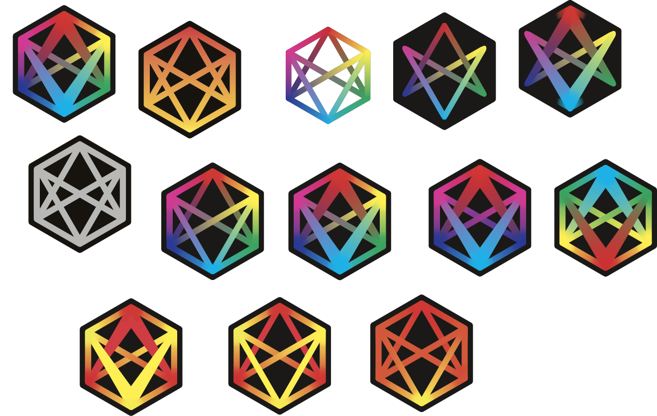
As you may know from my previous post, Vizamp started out with the name Graphica and had a different logo. Before settling on the logo you see today, there were several iterations. I thought I might share the story.
The first logo was a simple design I threw together in illustrator. It was a stop gap until we focused more intently on design. This incarnation survived as long as the name Graphica did. The design concept was based on the drawing technique used by one of our visualizations, the epicycloid, which connects several points along a circle to a series of other points. Not an epicycloid by definition but a similar Spirograph like effect is achieved.

Then came the name change to Vizamp and, of course, this brand update required a logo update. My first instinct was to recycle the existing logo but it needed to be presented with relevance to the new name. I realized the letters V and A in Viz-Amp could be brought out, if reworked a little.

I eventually settled on a design that was the same set of lines but with the edges removed and shaded to overlap the V in front of the A. It was a subtle connection to the name; perhaps too subtle.
Also, I was pretty sure a design this simple was being heavily used in one way or another, but I couldn’t find a company online using it. I knew the symbol resembled the pentagram, but I thought I could get away with it nonetheless. So I decided to get some feedback from r/logodesign on Reddit. I posted the logo and braced myself for the shoot-down. The comments were generally positive but one stood out. The shape is another well known occult symbol called the unicursal hexagram, more associated with paganism than devil worship. A variation of it is currently in use by a pagan spiritual organization in the UK called Thelema. While I have nothing against paganism, I’m not sure I wanted that association for Vizamp, as much as I wouldn’t want a Christian cross, since these kind of symbolic connections tend to get people stirred up. However even knowing this I considered keeping the logo. Having learned about the unicursal hexagram, I went down this wonderful Wikipedia rabbit-hole, finding out about the mathematical relationship the shape has to Pascal’s Theorem, which at the time Pascal gave the title - Hexagrammum Mysticum Theorem. A fantastic name for a theorem and an interesting side topic.

So the unicursal hexagram was the logo for a brief time, but my dissatisfaction continued to gnaw at me. I decided to have another pass at the design. Going back over the feedback I collected from various sources, I whittled away at the design, coming up with a one after another. Most had too much resemblance to the Freemason’s logo or Star of David. It seems long standing cultural institutions have taken all the coolest simplistic designs. Goes with being first in the logo business I guess.

Finally, I hit on the design that gave me that feeling. I’m pretty sure you know what I’m talking about if you make or design stuff for a living. It’s when you finally get to the point you’ve been anticipating for a while and it snaps into place in your mind. It’s usually accompanied by a good amount of satisfaction.

This logo was it and I knew it immediately. It has the V and A represented clearly, the word Vizamp fits into the design putting the letter A in the middle which aligns with the angles (60 degrees) giving it symmetry. While there is more lettering to the left side, the weight of the letters M and P to the right hold the balance. I like to visualize that if A was the center of a scales, either side would weigh the same. Additionally the overlapping V-A pattern is reminiscent of light or sound waves overlapping (before anyone comments I know this wouldn’t happen due to interference) but light and sound is what Vizamp is at its core.
So, the story boils down to: I started with a shape that had 12 lines, dropped 6, later removed 2 more, moved the remaining 4 closer together and stuck the word VIZAMP in front. In retrospect this is a remarkably straightforward decision making path but it didn’t feel like it. I’m reminded of the Zen quote I picked up on This Developer’s Life podcast last year “In the beginner’s mind there are many possibilities, in the expert’s mind there are few.” An experienced designer may have honed in on the final design in much shorter order, following the same path of decisions, doing so more deliberately, not getting distracted by other ideas and knowing when the design was still incomplete.
But the story doesn’t end there. The logo of a startup that brings images to life, needs a logo that comes to life.